

Whole Foods Market
Grocery Shopping Mobile App / Concept Project
What Is Whole Foods?
Whole Foods is a retail supermarket specializing in organic, healthy foods. Whole Foods makes money thru grocery sales, sales of prepared foods thru the website, and online sales and delivery of groceries thru amazon.com and the Instacart mobile application.
Overview
On this project, we started with understanding the users. Learning about their needs and pain points to empathize with them, so we would be able to identify the opportunities, and ultimately revamp the App's experience.
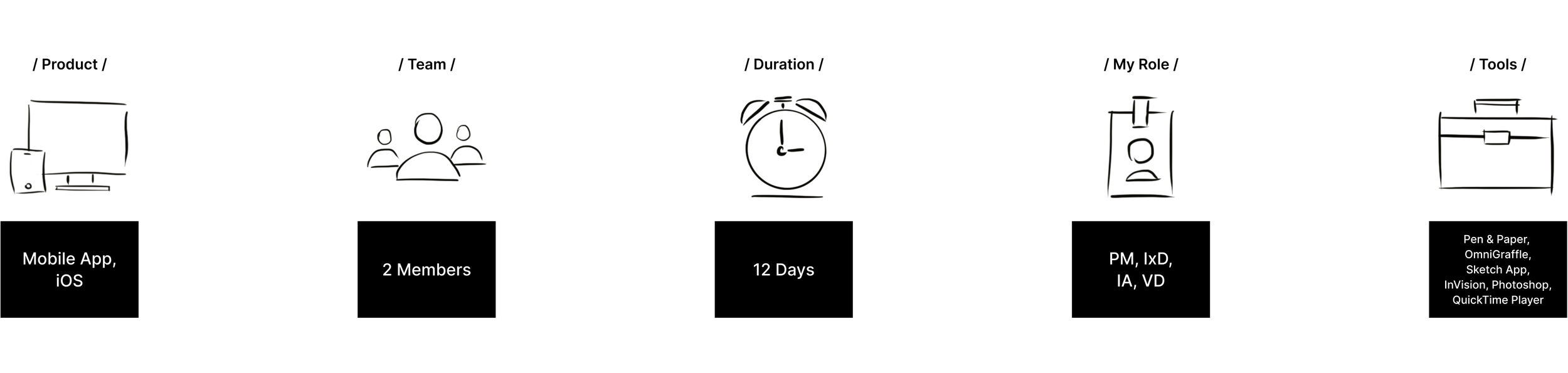
My Contribution
The Process
Project Management
As a PM for this project, I created a tentative project plan for our team and mapped out our deliverables and deadlines using Google calendar. To better organize the process, I broke down all the tasks with their respective timeline attached to each task and assigned them to the team members.
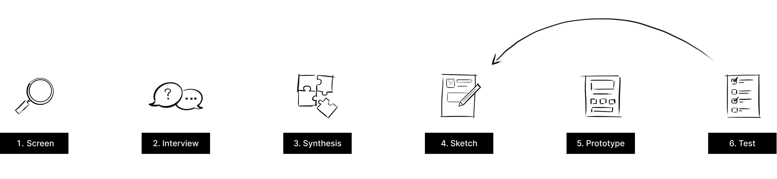
DISCOVER
People have busy lives and are looking for ways to save time and energy expended on their everyday tasks and chores to devote more time to activities they enjoy. Our goal is to create an experience with the Whole Foods app that streamlines the way people shop for their Whole Foods groceries.
For getting more insights into our users’ shopping habits, the team researcher, Irene Huberman started interviewing the users.
User Interviews


Affinity Map
Based on our interviews, we created an affinity map to have a better understanding of users’ behaviors, needs, and objectives.
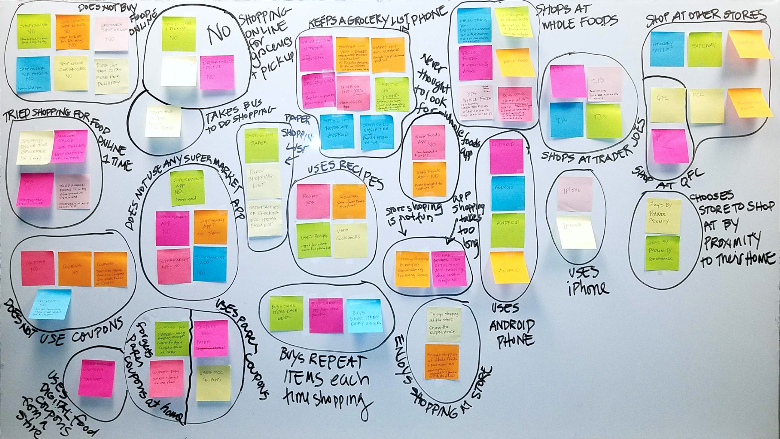
Our findings from initial interviews:
Everyone uses a shopping list.
5 out of 7 keep their list on their phone.
2 out of 7 use paper lists.
Coupons are not the priority, 2 out of 7 use store coupons.
The financial demographic of Whole Foods doesn't focus on coupons to save money.
DEFINE
PROBLEM:
It is like the app is left alone, meaning it hasn't been updated for a long time and has some old coupons on it! Whole Foods app doesn't offer any industry-standard useful services as an online grocery shopping application. For instance, Besides all shortcomings, it doesn't have any search capability which means it is not easy to look for a specific product, and ultimately, the app is totally useless.
SUGGESTED SOLUTION:
First, we are going to add some basic features to make it like a regular online grocery shopping application. Then based on our research and users’ needs, we are going to add more useful features to the Whole Foods app which will create a unique experience for users.
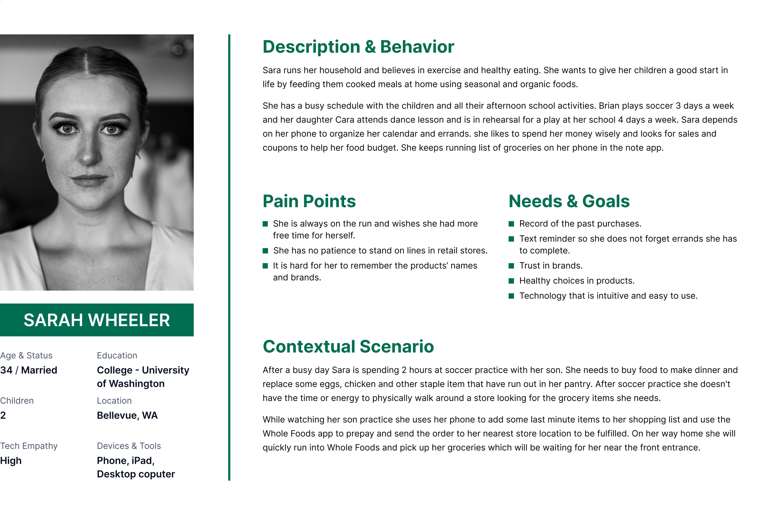
Primary Persona
Competitive Analysis Chart
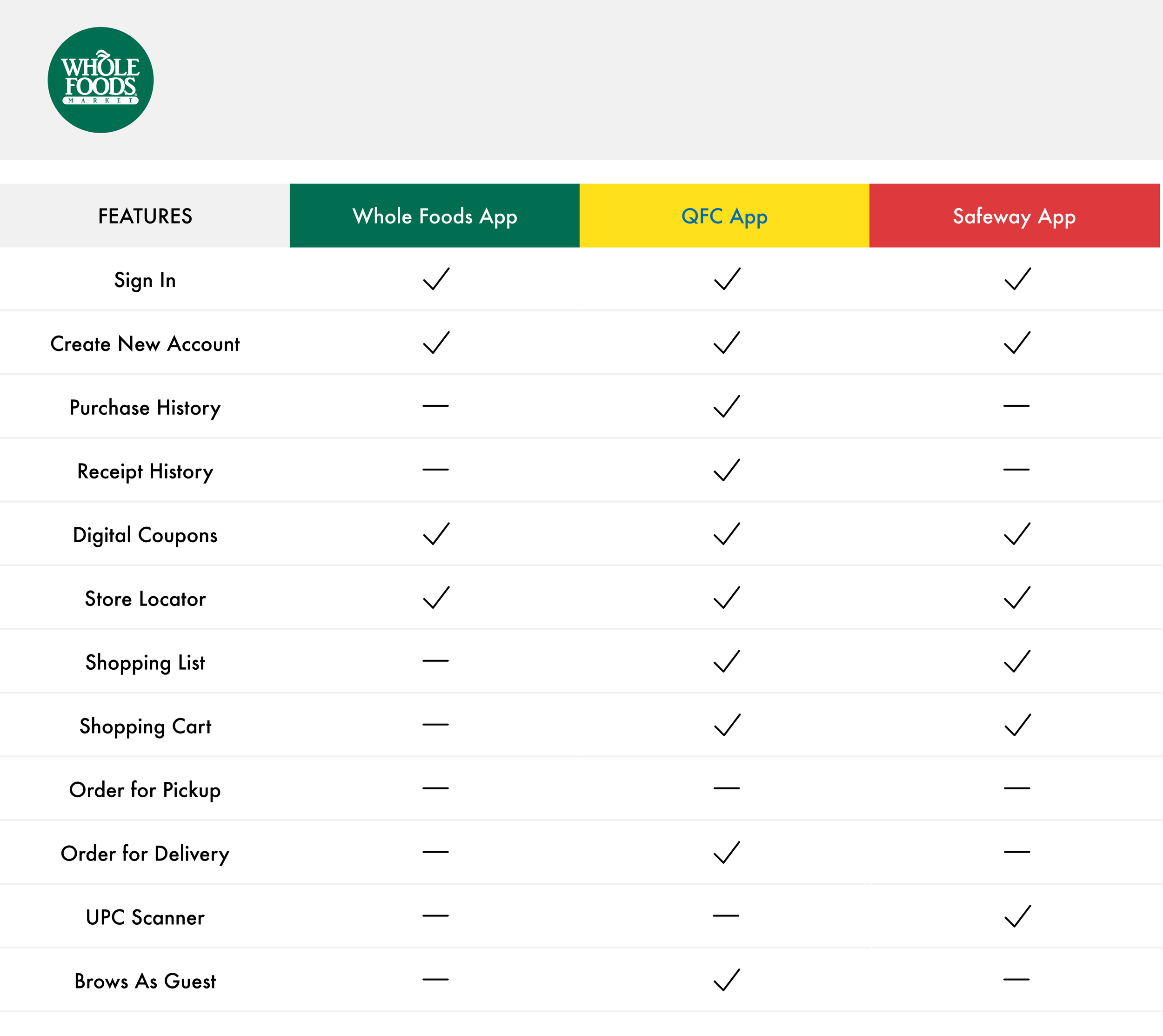
After identifying our competitors, we created competitive analysis chart. This chart helped us to identify the areas we need to focus to improve in our design.
DEVELOP
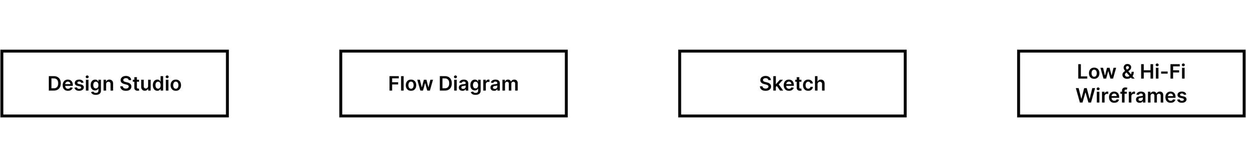
Design Studio
After knowing all needs and goals of our primary persona and analyzing the competitors, I facilitated a design studio session with the team.
This activity helped us to review all features of the current app and the features we targeted as opportunities for Whole Foods app.


This practice helped me to identify the structural problems of the Whole Foods app and had feedback on my ideas from my teammate. In this activity, we also discussed the contents of each step of the proposed design.
Flow Diagram
For the next step of the design process, to be on the same page as a team and to look at the process from a bird-eye view, I designed a flow that showed each step that users should take to complete their tasks through the app. This exercise helped us to review the process from beginning to end and identify the gaps and opportunities in the flow.


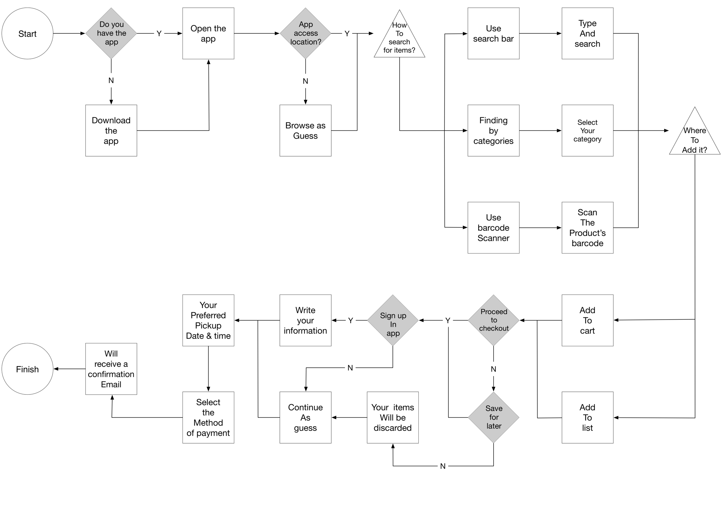
This diagram is based on our initial ideas and it had changed through the iteration processes.
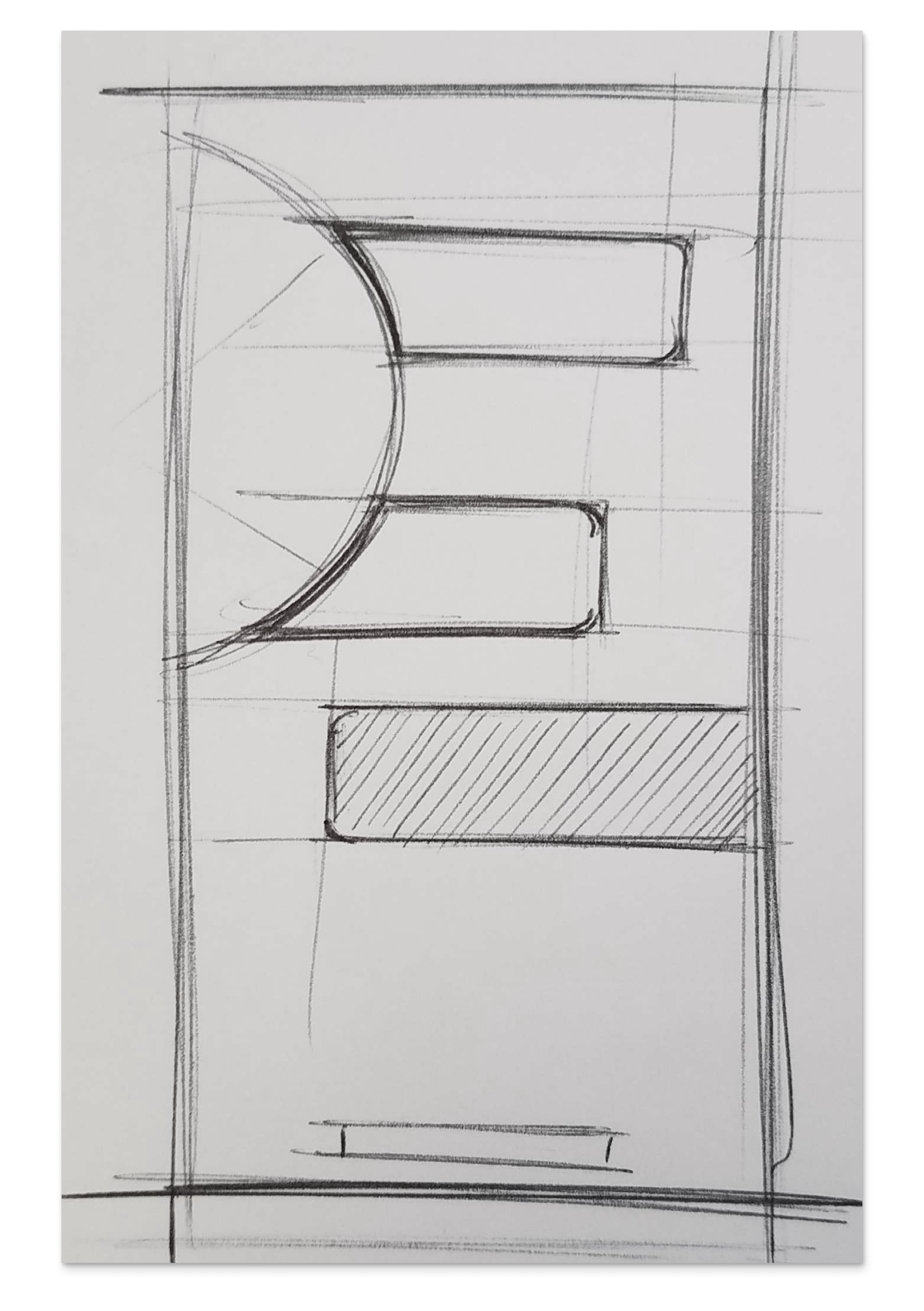
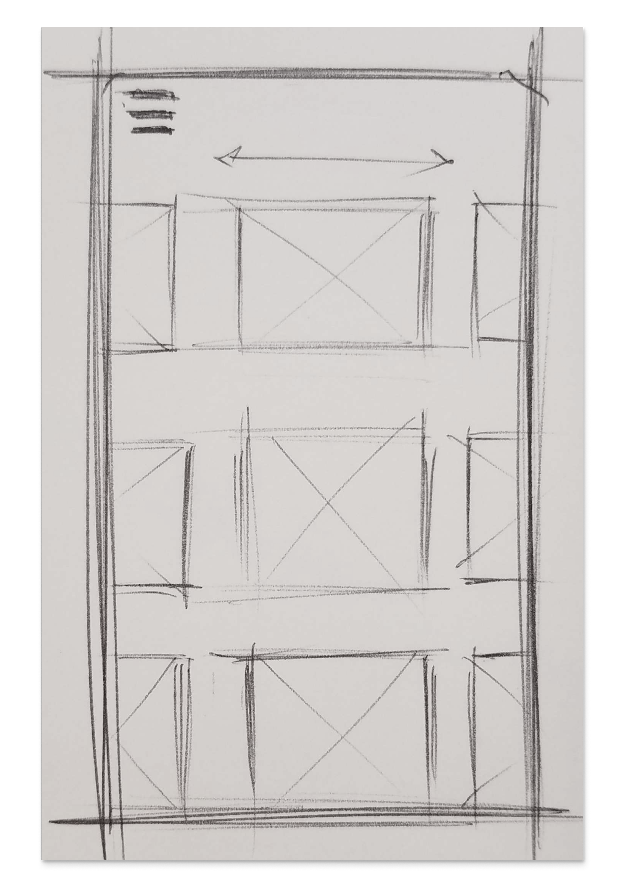
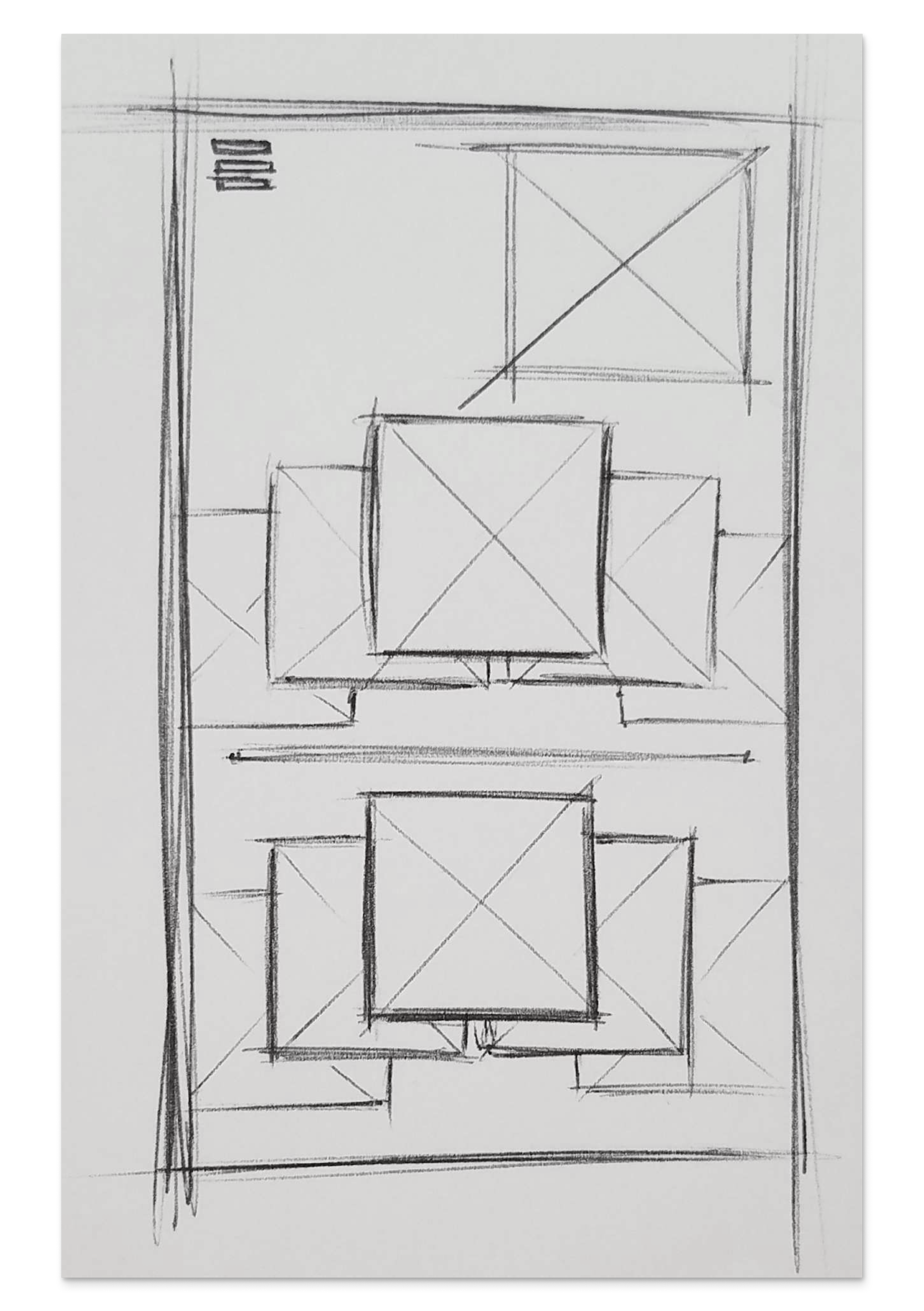
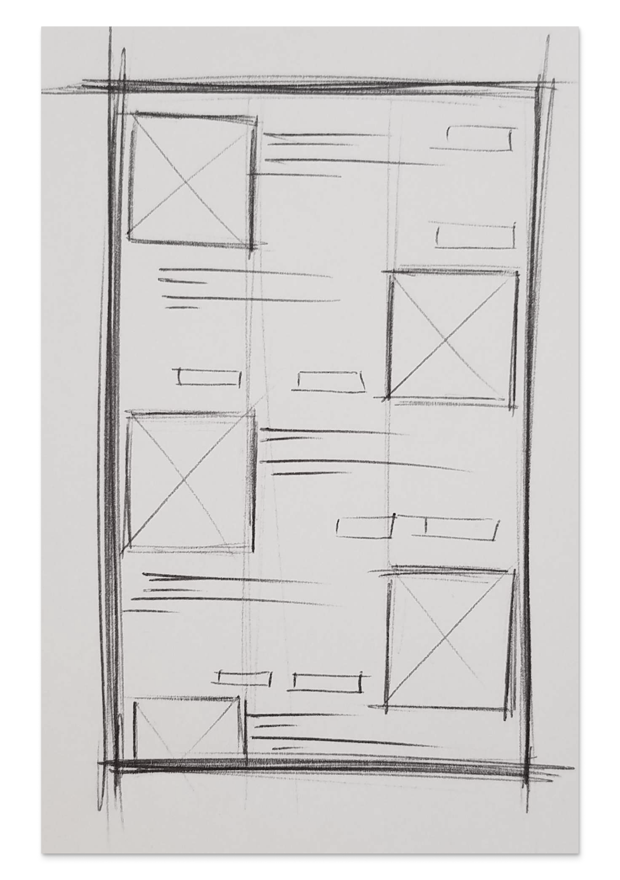
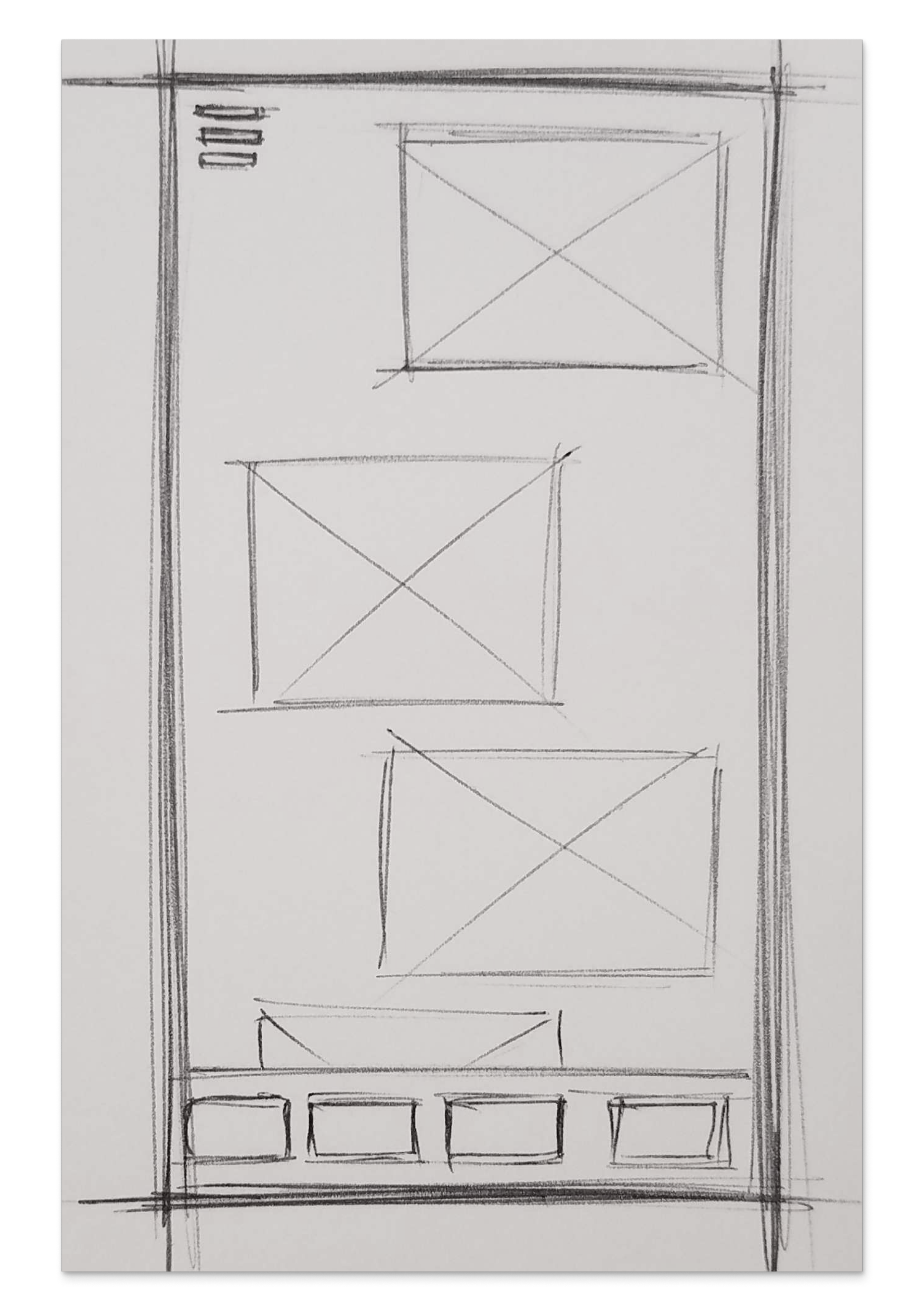
Ideation & Sketch
For me sketching is a great approach to trying different ideas and styles quickly. This helped me to visualize the different designs and see how the interaction would be. With all the data points I had learned, I started to sketch and find the best template for the product, and work on applying it to the rest of the wireframes. You can are some of my sketches below.
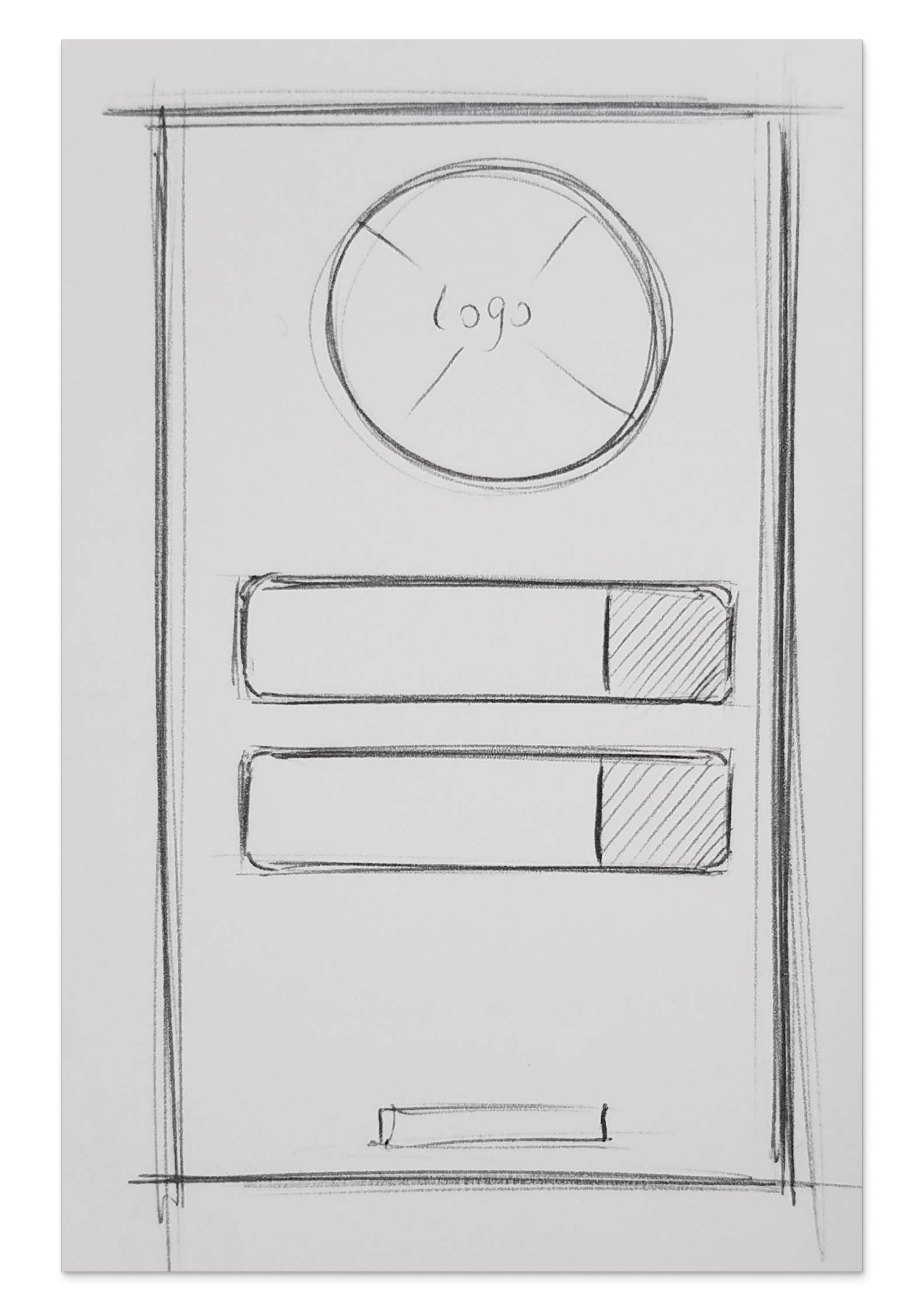
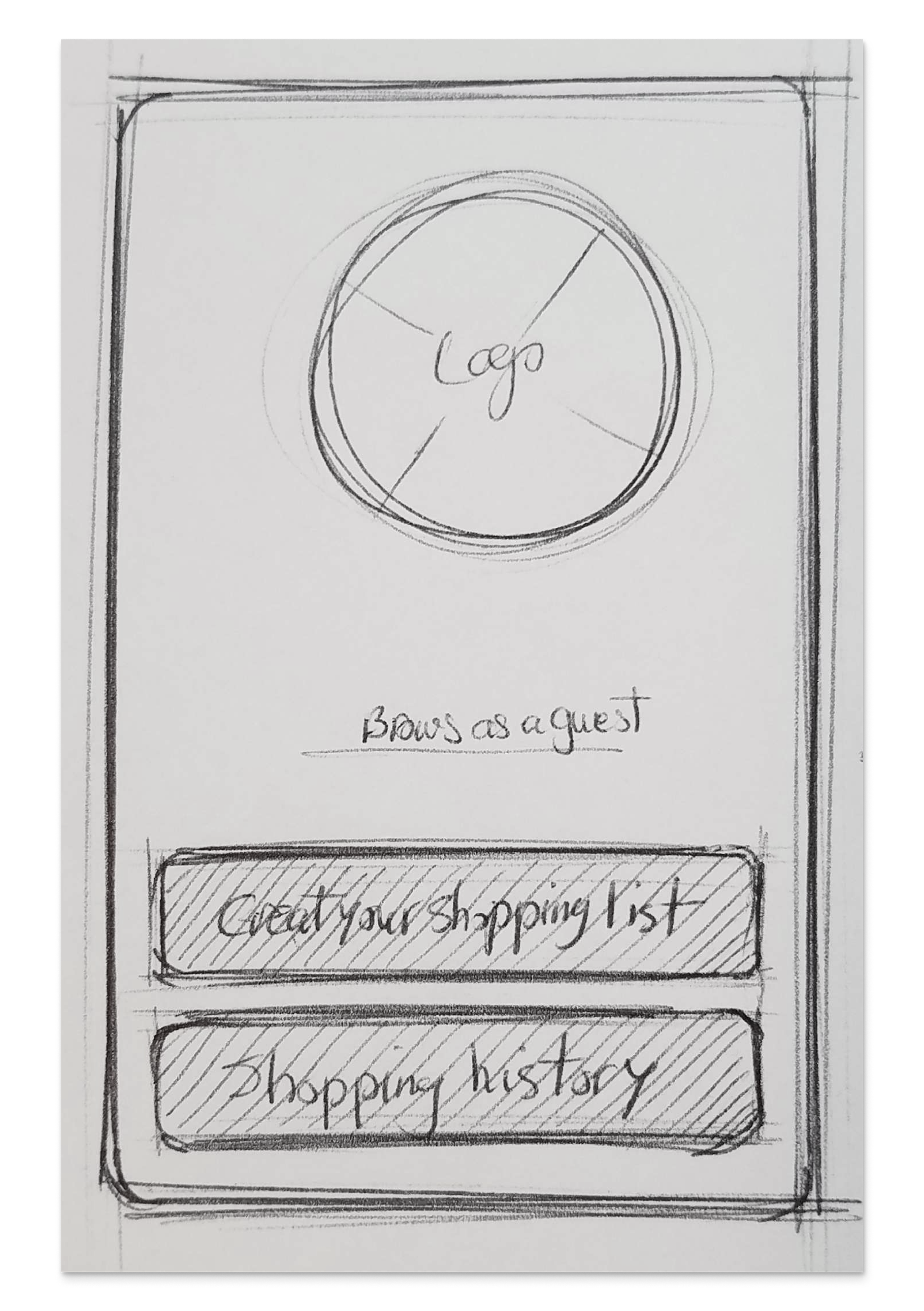

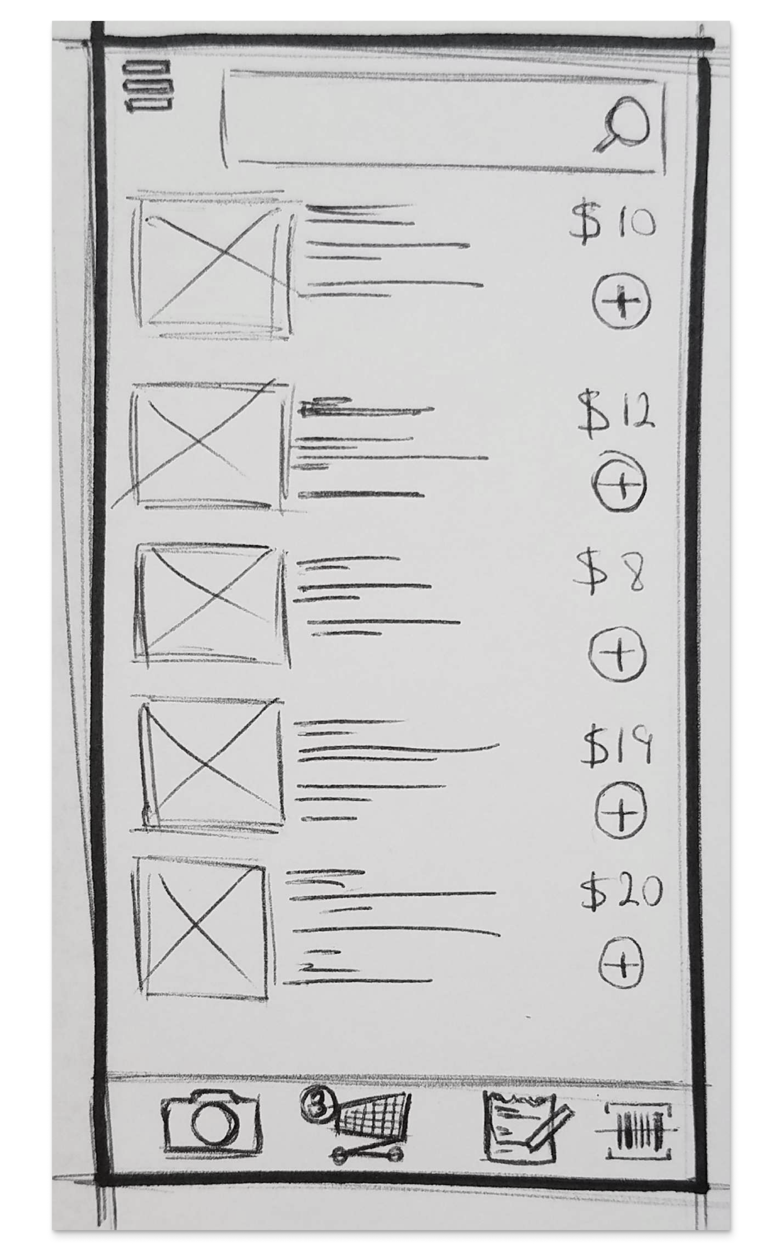
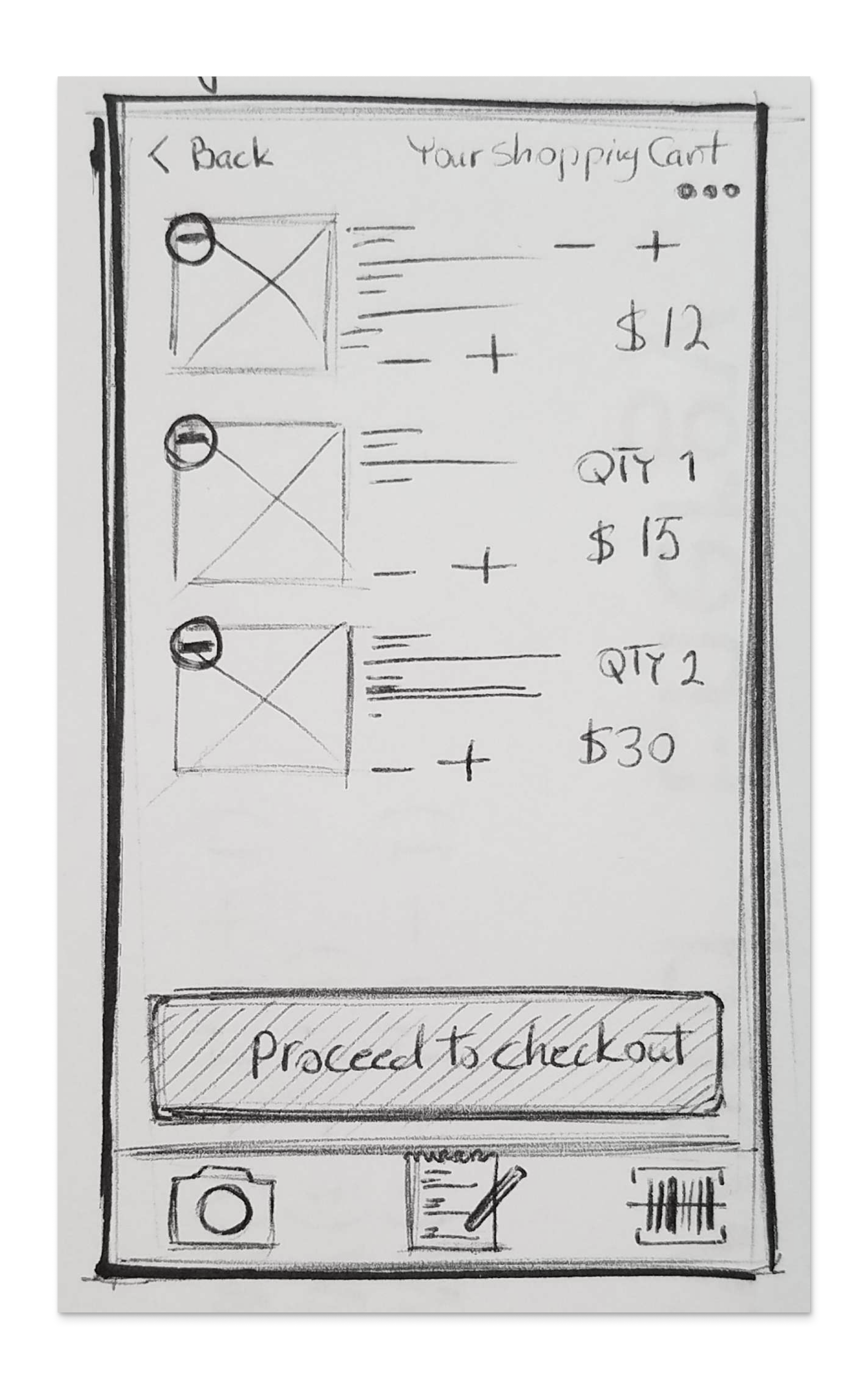
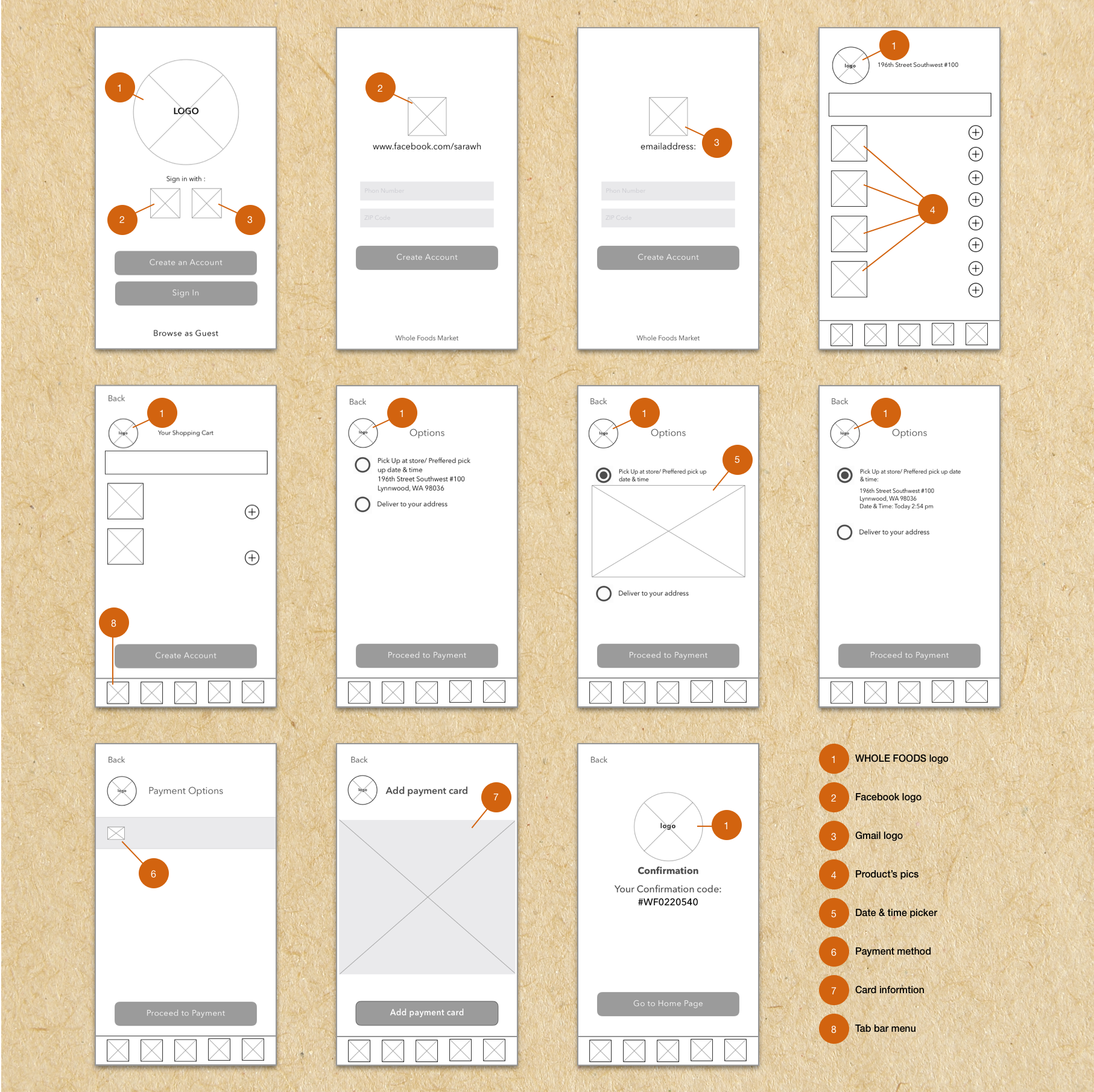
First Usability Test on Paper Prototype
Once I found the right layout for the design, I sketched the rest of the screens for a simple flow and had it tested for the initial evaluation.


Feedback on the paper prototype:
Users need to have access to their previous purchases to make sure they are buying the same product.
Tab bar features need to be categorized properly. Like, have a camera icon and barcode scanner under one category.
Having the “Add to List” feature could be useful, especially, when you want to save an item for future purchases.
DELIVER
Wireframes
Based on the feedback from the first round of usability test sessions with the paper prototype, I started to design the Low-Fi wireframes and created an interactive prototype for the next usability session.
Low-Fi
Before I jump to the Hi-Fi screens, I started with low-fidelity wireframes. This helped me to find the right layout and structure for the App. This also gave us an opportunity to review the flow one more time as a team and make sure that we are all on the same page.
High-Fi
After I designed the layout and finalized the flow, I worked on the Hi-Fidelity screens. Adding more details and working on the visual aspect of the product, makes it easier for participants of the usability session to understand the flow and would help them to give accurate feedback.
First iteration based on the feedback from the paper prototype:
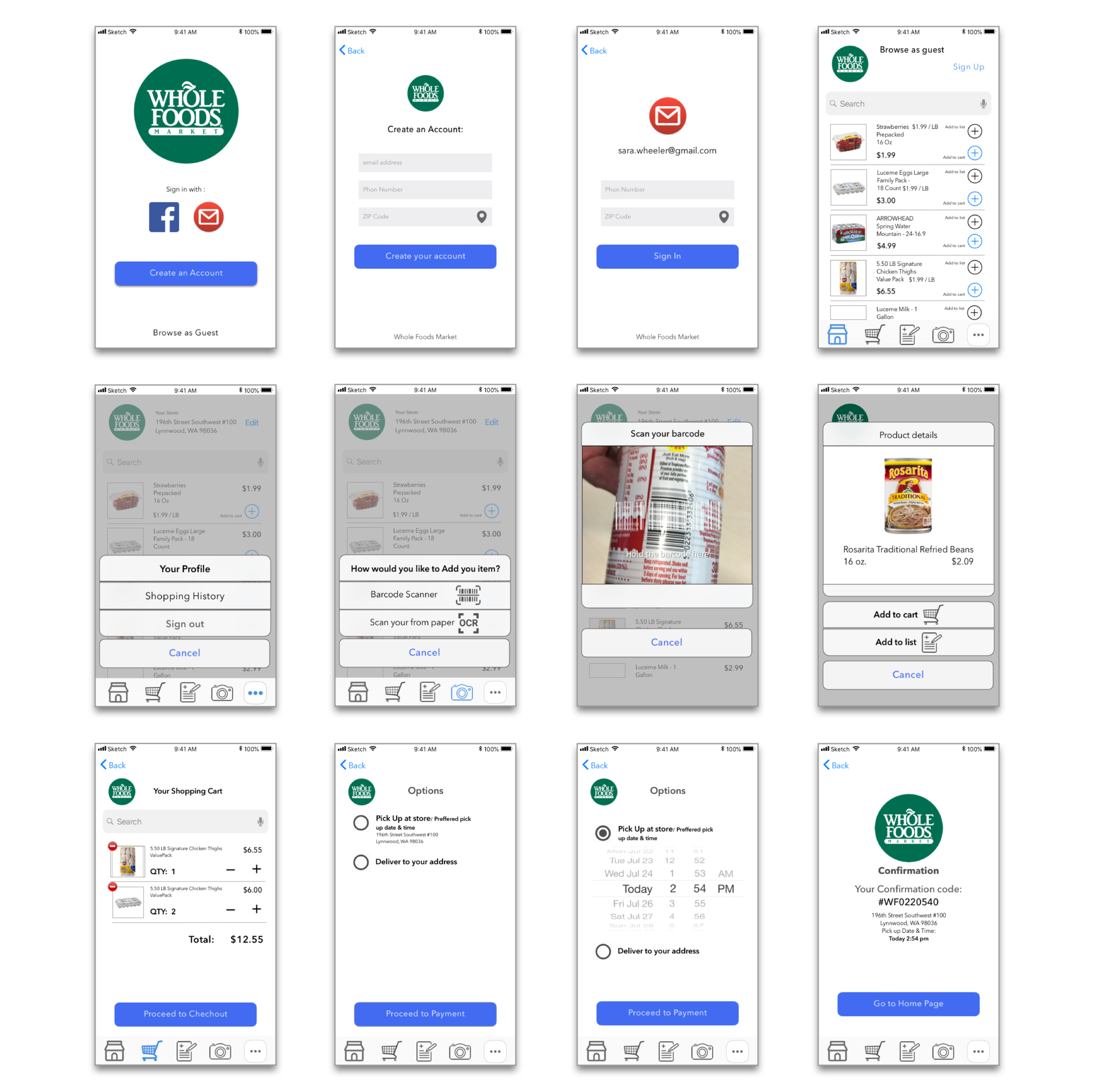
Second usability test session and feedback on the second design:
On the landing page, one user thought it was a pre-made shopping list.
They needed to have categories on the homepage, so they could find their products easier.
The color I used for the primary CAT wasn't accessible. Although at this stage my main focus area was on the flow, the taxonomy, and the contents, it was insightful to receive such feedback.
Some of them are confused with the OCR (Optical Character Recognition) feature.
They liked the idea of a barcode scanner that enables them to find any product by scanning their barcode.
The Bottom Navigation Bar is too busy.
Two of the participants didn't understand the function of the Camera and the Paper icons.
Third iteration on hi-fi screens:
Based on feedback, I iterated the design to address the user's needs, along with some UI enhancements.
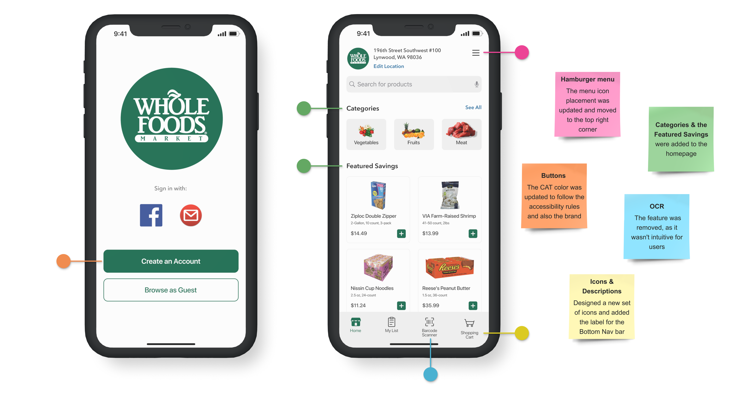
Final Iteration
For my final design, I added two more things:
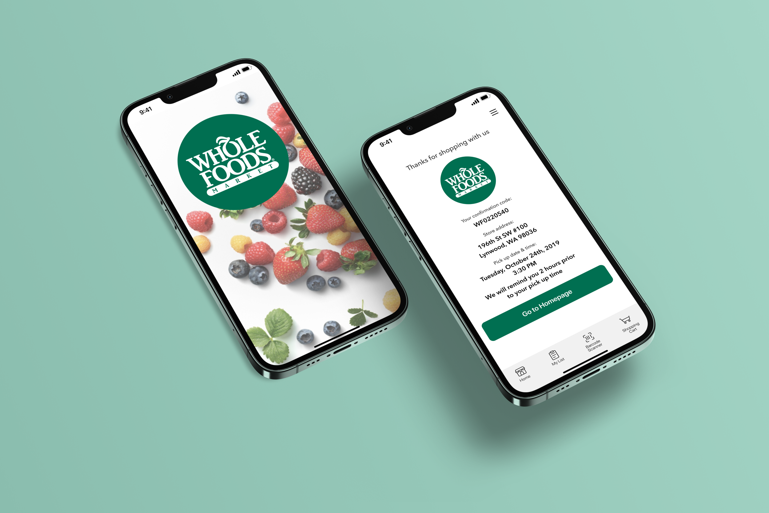
Splash page as a welcome page.
In the final usability session, one of the participants mentioned that one time she forgot to pick up her items due to having a busy day! Text Reminder is a feature that reminds the customer to follow their pick-up schedule and don't miss it.
Next Step
OCR feature, this feature will be the game changer in the future. It will scan the paper and add the items to users’ shopping lists.
Siri Integration, use Siri to add items to the shopping list.
Item Locator feature, this would be helpful when shopping in a store. It will help people to locate their items easier and faster in their local store.
Conclusion