Meddle
Dating App / Let your friends swipe!
What Is MEDDLE?
Meddle is a new, free dating app that allows your friends to find someone for you. You can either sign up as a Single person or a Meddler (the person who wants to help their single friend find the right match) on the app. A single person is still able to swipe like on Tinder, but they can’t match with anyone by themselves and need at least one Meddler to confirm the match.
Overview
In the initial meeting with the CEO of the company, we were asked to improve the overall experience of the users and revamp the user flow, architecture, and visual design of the App. An intuitive and more visually appealing experience that potentially encourages more people to download the app.
My Contribution
The Process
RESEARCH
We started off our project by downloading the app and trying it out for ourselves. We wanted to explore the onboarding processes for Meddlers on the app.
By doing this, we were able to get a sense of the app's features and what was the current onboarding process like, before our first meeting with the CEO of Meddle, Peter Leonard. We prepared a series of questions that we wanted to ask, including questions around; how did he come up with the idea for the app? Where did he see it going? And his greatest hope and fear around the app.
What we learned from our initial meeting was; the main concern was the Meddlers onboarding experience, as the current process was not straightforward and intuitive.
He also shared his long-term vision for the project with us, stating that he hopes to expand the app's functionality to cover other aspects of people's lives in the future. Different domains, like helping each other make a decision about buying a house.
PROBLEM:
People who want to use this app need an easier way to set up accounts on Meddle because the current onboarding process is cold, confusing, and frustrating.
SUGGESTED SOLUTION:
By simplifying the onboarding process and making it more engaging and fun, we believe more users will be encouraged to complete the setup process and invite their friends to the app.
LOGO DESIGN
I started with the first element of the app, the logo. Based on what I learned about the whole idea of the app, my first impression was that some improvements needed to be made. So, we started with simple research to understand what people think about the app without knowing it - just by looking at the logo!
Questions:
Can you guess what this app does?
And this question after explaining what does Meddle do:
How relevant did you find this logo for this app?
Answers:
Before knowing the app:
The majority of them thought it was an engineering application and couldn’t understand what Meddle is about!
After they were explained about it:
Most of them were confused and thought maybe this is not the best logo for a dating app.
Click here if you want to see how I helped my client with their new logo.
Wireflow
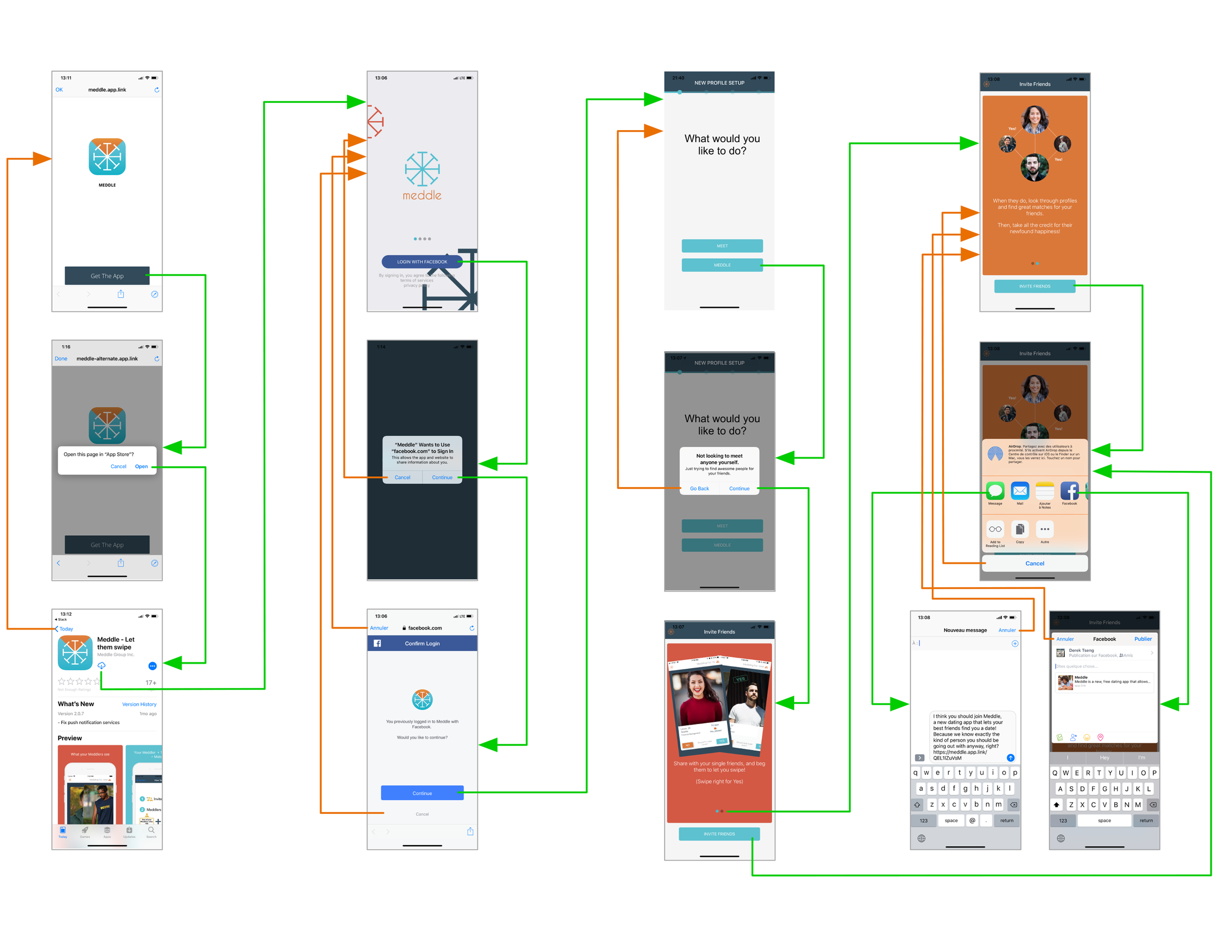
As an information architect, I wanted to have a better understanding of the flow of Meddle app. I went through the details of each step and screen in the app and then drew the current wireflow of Meddle to find the weaknesses related to contexts and information which our users need to communicate with. With this activity, I would be able to identify the problems and revise them afterward.
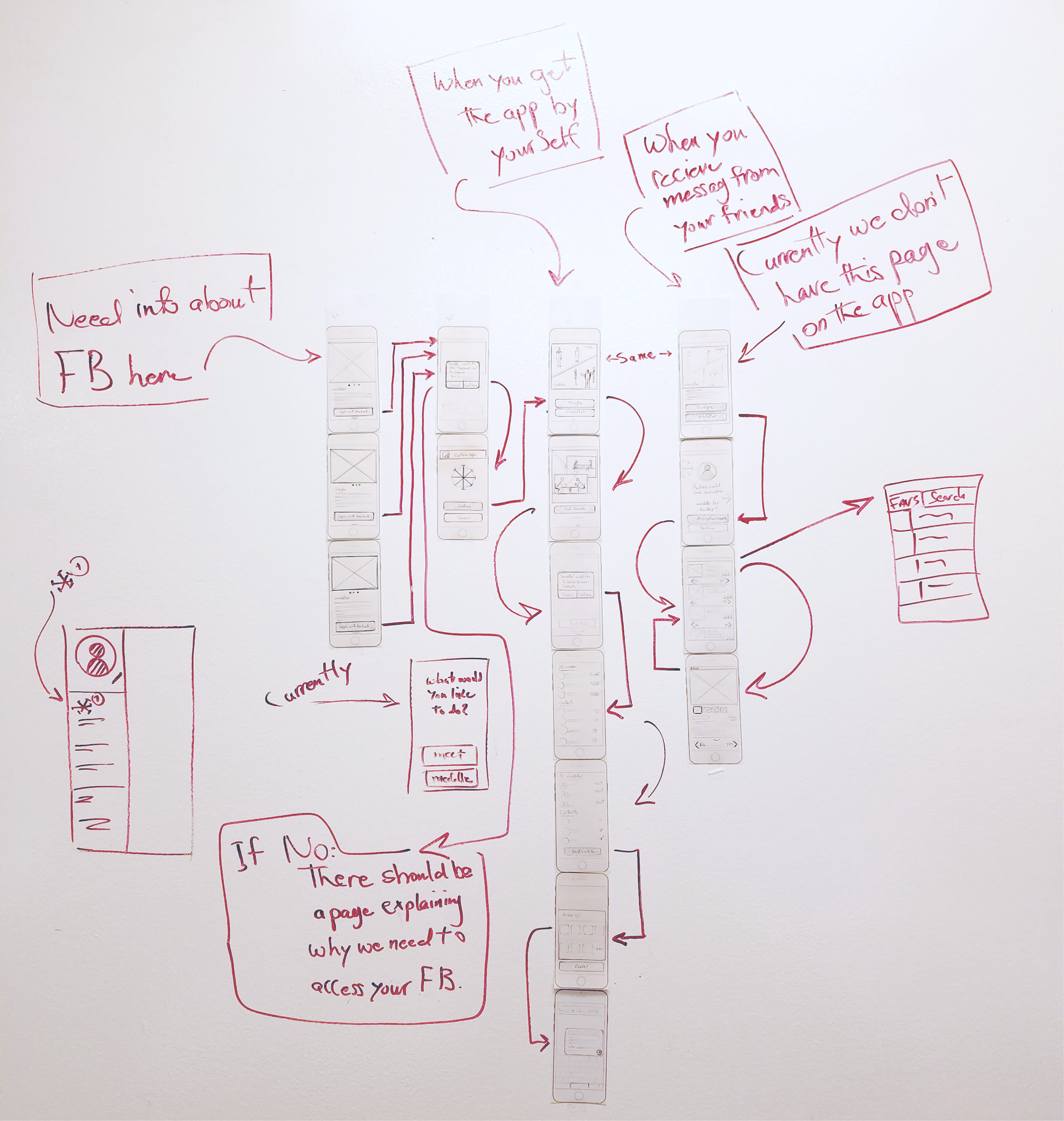
Through this wireflow, I found the areas that needed to be changed to improve the onboarding process of Meddle app and specifically Meddler’s flow. I started to sketch and tried to correct the identified problems.
When I finished my sketches, I put them on the wall and asked my teammates to join me and shared my thoughts with them. I also asked them to give me feedback on my work and discuss them.


This activity gave us an opportunity to share our ideas. At the end, all of us were on the same page and Derek (interaction designer) was able to create our first paper prototype to have it tested by Pete (researcher).
Color Palette
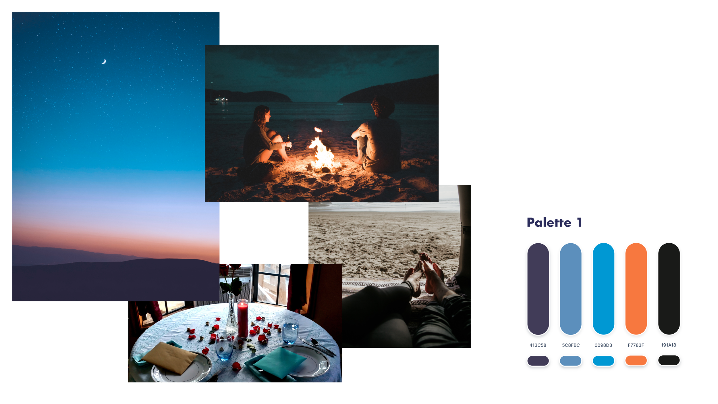
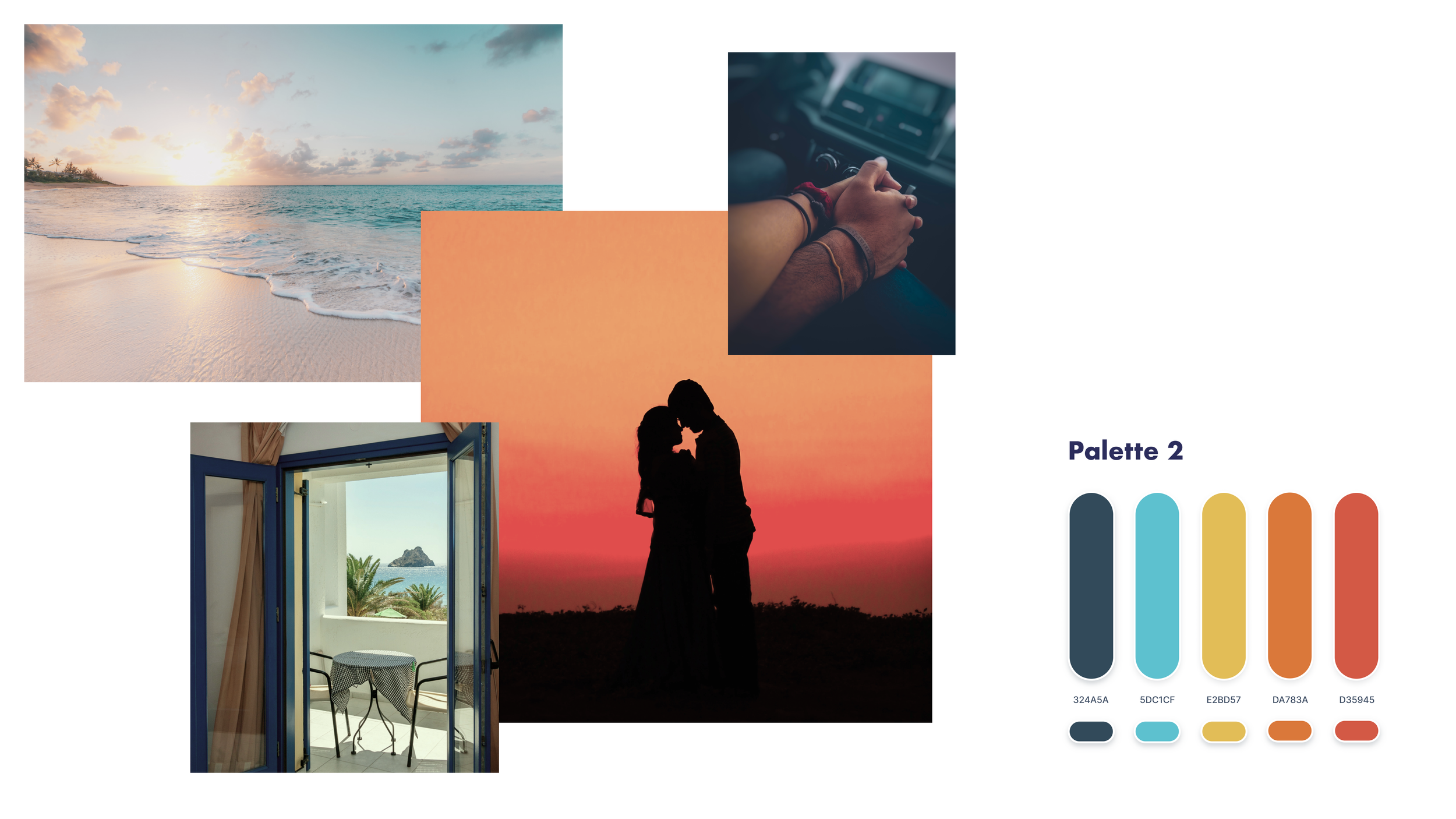
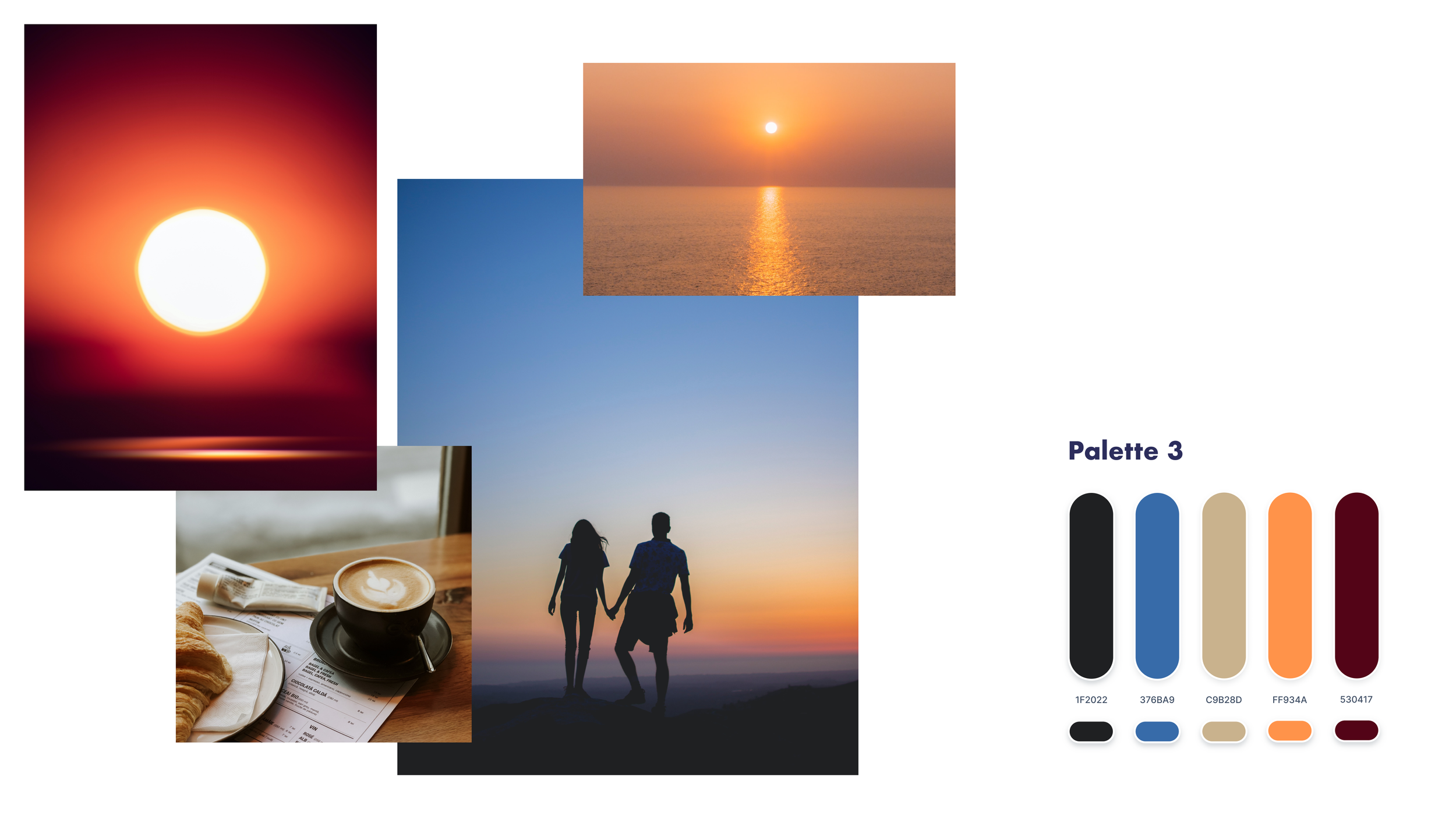
While we were busy iterating our design based on feedback from our users, I started to search for a new color pallet for Meddle. I started with a mood board to find the best match with the idea of the app.
Ultimately, I chose palette 2, which has more vibrant and warmer colors. On the other side, the meanings behind these colors were relevant to the whole concept of the app, as well.
Hi-Fi Wireframes
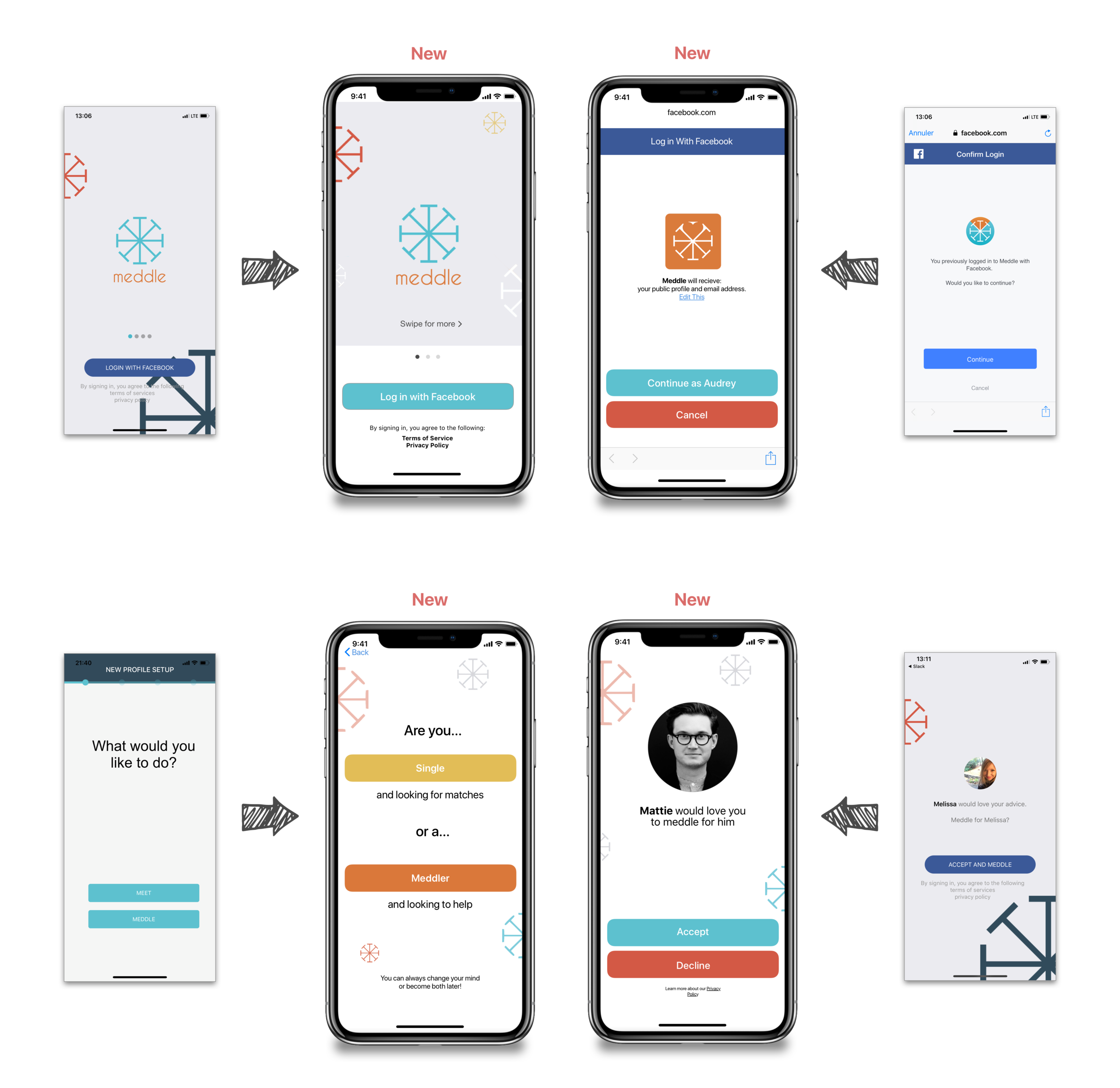
After choosing the right palette for my design and having the final version of our wireframes after three iterations, it was time to create the High-Fidelity screens as a visual designer.
Here are some of them to compare:
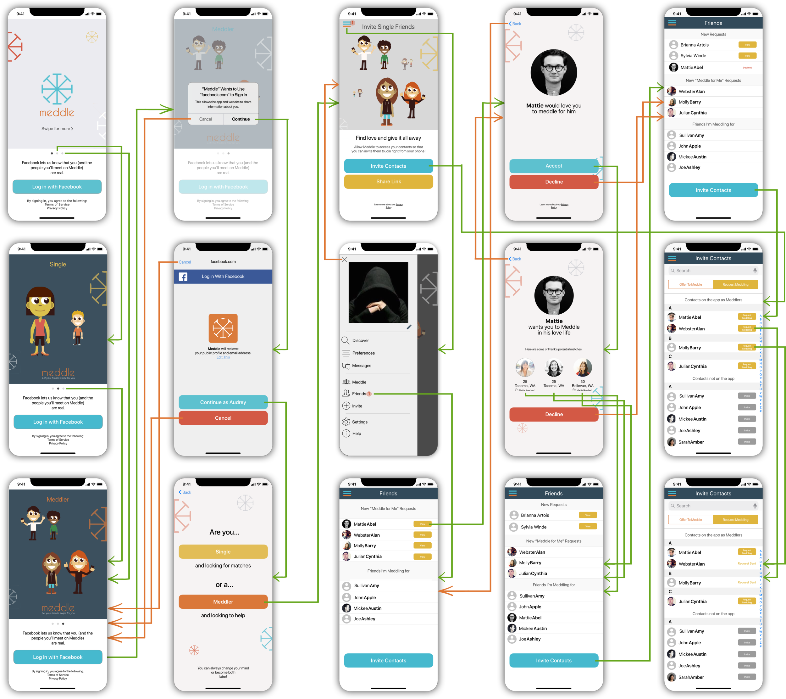
Other high-fidelity screens and new Meddle's wireflow:
In this wireflow you can see the onboarding process of meddlers when their friends ask to help them and share Meddle app's installation link with them. This wireflow covers the process after the app was downloaded.
Next Step
Improve Meddle's website. Unfortunately, we didn't have enough time to work on their website.
Update some of the UI components, to follow the accessibility principles.
Looking for alternative ways to sign up besides Facebook.
Add a video feature, since the video is the future.
Resolve technical issues.
Have an eye on December 26th. There is a 60% spike in online dating profiles created between December 26th and January 14th. They can add more features or update their app with this date in mind.
Conclusion
It has been a while since my client was struggling with encouraging more users to download Meddle and keep them engaged on the app.
We tackled Meddle's problems from different angles. From addressing some fundamental issues like the IA of the App, taking out ambiguities users may encounter to improve the visual aspect of Meddle, by designing the new layout and components and even a new logo to impress users with their first impression.
Here is a link to Meddle on App Store


